Common
Coffee for all
Client:
Common
Year:
2025
Type:
Branding
,
Identity
Contribution:
Brand Design


Logo
Common's final logo emerged by connecting letterforms through ligatures, creating a sense of unity.
After multiple iterations, I selected a standalone "Common" wordmark to allow for future brand expansion beyond coffee into potential new markets like loose leaf tea.

Logo Spacing
The logo spacing guidelines use the wordmark's x-height to create consistent white space, ensuring optimal legibility.

Typography
General Sans serves as Common's primary typeface. The combination of this sans-serif font with the interconnected, stylized wordmark creates an elegant contrast—reflecting both the brand's premium category and its inclusive "coffee for all" message.
The typography system uses the Golden Ratio (1.618) to establish a clear visual hierarchy across all mediums (packaging, web, social channels), ensuring the brand can evolve within a dynamic industry without requiring major design changes.

Packaging
Common's packaging design went through multiple iterations. I aimed to create a simple, unified packaging face that aligns with Common's brand guidelines while allowing each blend to maintain a distinct identity. These early concepts explore this approach.

Visual Extension Exploration
Common's additional products (beyond its Classic blend) are defined by emotions—Joy and Mellow—that people associate with coffee drinking. Each symbol's color and design reflects its corresponding emotion.

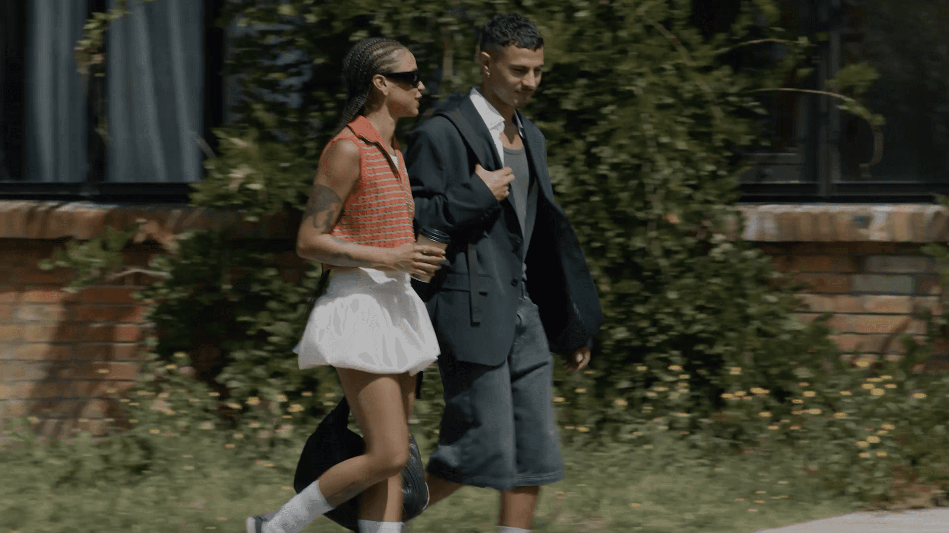
Imagery Selection
The imagery selection for this project needed to reflect Common's mission of bringing high-quality coffee to everyone. I carefully chose images that captured an elevated aesthetic while maintaining an approachable, down-to-earth feel.

Digital Touchpoints
As a DTC company, Common needs to thrive in both digital and physical spaces. I chose Common's Classic Blend icon as the digital favicon across all platforms to maintain brand consistency, representing the brand's original product.
Recognizing the ordering process as a key customer touchpoint, I created a conceptual wearable UI to showcase the brand experience beyond traditional mobile interfaces.

Additional Touchpoint Development
Beyond packaging and digital elements, I created apparel merchandise mockups using stock images.
I enhanced realism by applying a texture displacement map for screen printing effects in Photoshop, along with custom highlight, shadow, and contrast layers to simulate natural lighting patterns.